
Professional Services Website Design for Businesses with a Lot to Say
Professional service businesses tend to have a lot to say, and for good reason.
You may have multiple services, several different types of clients, years of experience, specialized terminology, a process that needs some explaining, FAQs, service areas, credentials, and plenty of details that help someone understand why you’re the right choice.
The instinct can be to cut it all down in the name of a clean website, but less isn’t always better.
Sometimes, you just need to design the information better.

A professional services website can say a lot without feeling like a lot.
That’s one of the biggest jobs of professional services website design.
Your website needs to give people enough information to make an informed decision without making them feel like they’ve been handed a textbook. They should be able to land on a page, understand what you do, find what matters to them, and know where to go next.
Our recently launched website for Appraisalsmith is a great example of that.
Katie Taylor of KB Taylor Marketing came to the project with the strategy and copy already thoughtfully mapped out. Our role at JonesHaus was website design and development: taking that information and figuring out how someone should experience it, because a content-rich website doesn’t have to feel content-heavy.
More Information Doesn’t Have to Mean More Complicated
Designing a website for a professional service business is very different from creating a site where a beautiful portfolio or a collection of products can do most of the talking.
In professional services, what you’re selling is often less tangible.
You’re selling your expertise, your experience, your knowledge, your ability to solve a problem, and, perhaps most importantly, you’re asking someone to trust you.
Sometimes that person doesn’t completely understand the service they need yet, either. They’re coming to your website because they have questions.
That means the answer probably isn’t a home page with three sentences of copy and a pretty photograph.
There needs to be enough substance for someone to understand what you offer and feel confident taking the next step. The design has to make all of that substance feel approachable.
For Appraisalsmith, there are different appraisal services, different reasons someone may need an appraisal, and different audiences arriving at the website, and all of that information has a purpose.
Our job wasn’t to make it disappear so the website could feel more minimal; it was to give it structure.
That balance is an important part of professional services website design: authority without feeling intimidating, information with breathing room, consistency without losing personality, and detail without making someone work too hard to find an answer.
That’s when design becomes a lot more than making something look good.
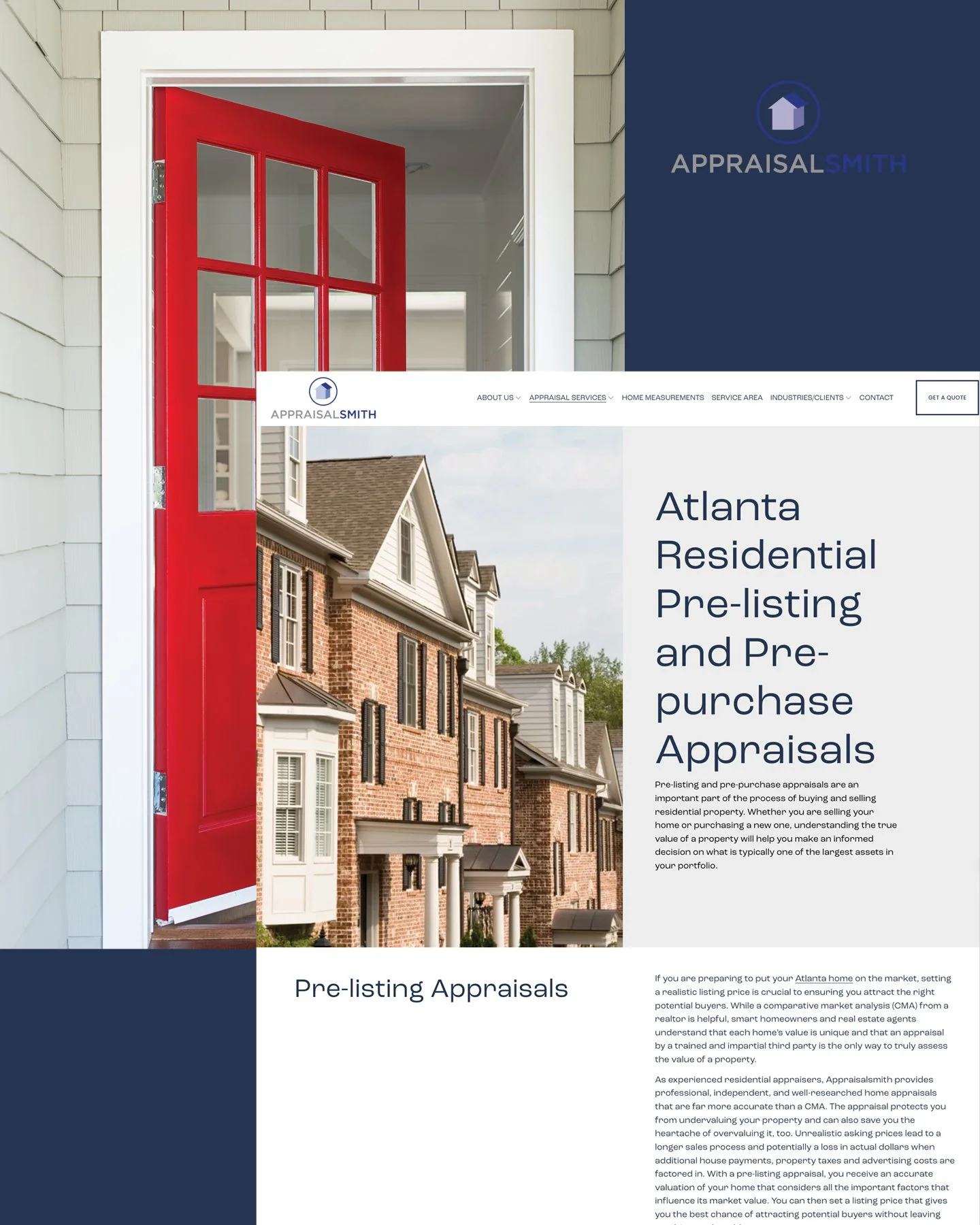
Detailed service information becomes easier to understand when design gives it structure and hierarchy.
Show Them Where to Look
Most of us don’t arrive on a website and dutifully read every word from top to bottom.
We scan.
We notice the big headline, and then maybe the photograph. Our eye catches a subheading, a button, or a piece of information that feels particularly relevant. If the page has been designed well, we start understanding the story before we’ve read every sentence.
That’s visual hierarchy.
You don’t need to know the design terminology to recognize when it’s missing. It’s that feeling of landing on a page and thinking, Where am I supposed to look first?
A designer has plenty of tools to answer that question without ever writing another word: headline size, typography, color, white space, photography, content blocks, buttons, placement, and repetition.
Those choices tell the reader, start here, then look here, and this is what you can do next.
That was particularly important for Appraisalsmith because we had meaningful information to communicate throughout the site. Rather than allowing the pages to become long walls of copy, we created visual breaks and different levels of emphasis so someone can move through the information naturally.
The copy still gets to do its job, and the design simply helps people find their way through it.
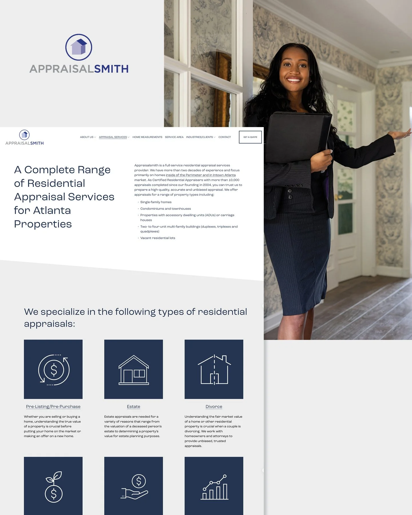
Clear hierarchy helps visitors quickly understand the range of services without having to read every word first.
Give the Content a Little Breathing Room
White space sometimes gets treated like empty space that needs to be filled.
We see it differently.
White space gives your content room to breathe, creates separation between ideas, tells your eye that one thought has ended and another is beginning, and on a website with a lot of important information, that breathing room becomes even more valuable.
Longer or more technical content becomes much easier to take in when it’s broken into shorter sections with clear headings, supporting visuals, occasional callouts, and lists where they genuinely make sense.
That doesn’t mean turning every sentence into its own design element. It means creating enough variation and space that a reader isn’t confronted by one uninterrupted block of information.
There’s an important distinction here: Content-rich and cluttered are not the same thing.
For a professional service business, your visitor may already be trying to understand something unfamiliar, or make a decision that matters. Your website shouldn’t add unnecessary friction to that process.
With Appraisalsmith, the goal wasn't to decorate the copy; it was to support Katie’s strategy and content with a design that made all of it easier to use.
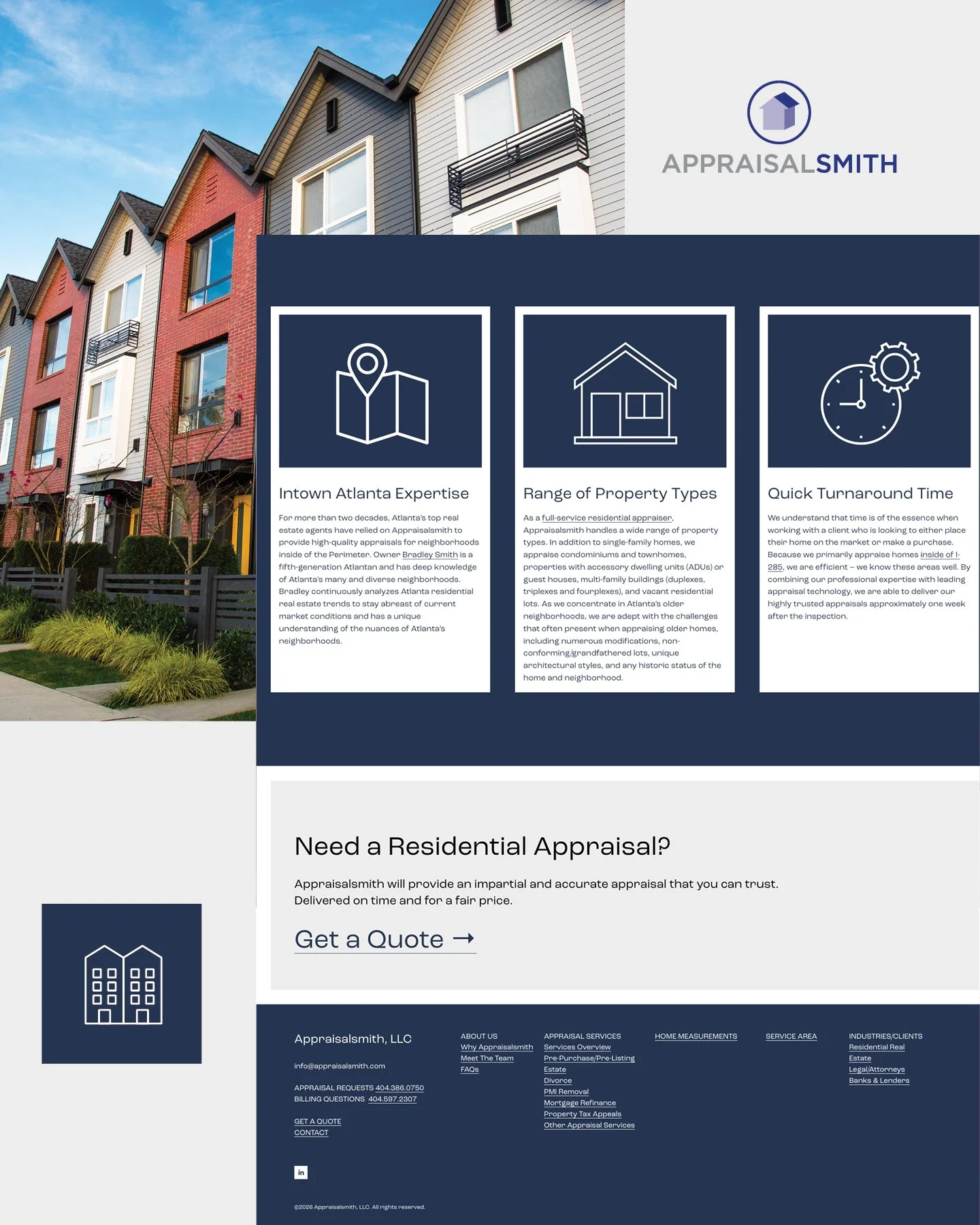
Breaking information into clear sections makes a content-rich page easier to scan, understand and act on.
Credible Doesn’t Have to Mean Corporate
There’s another trap professional service businesses can fall into: assuming credibility has a particular look.
Suddenly everything is navy blue, the photography feels like stock, and the layouts could belong to any company in the industry. The website certainly looks professional, but you could swap the logo with a competitor’s and barely notice.
Professional and personality are not opposites.
Credibility can come from consistency, strong typography, thoughtful spacing, intentional color, quality photography, clean layouts, and all of those little polished details that tell someone care went into the experience.
Those same choices can also make a business feel more human.
That was part of the opportunity with Appraisalsmith. Appraisal is a technical, expertise-driven service, but the website didn’t need to feel cold because of it. The visual experience could still have personality while giving the information, and the expertise behind it, the weight it deserved.
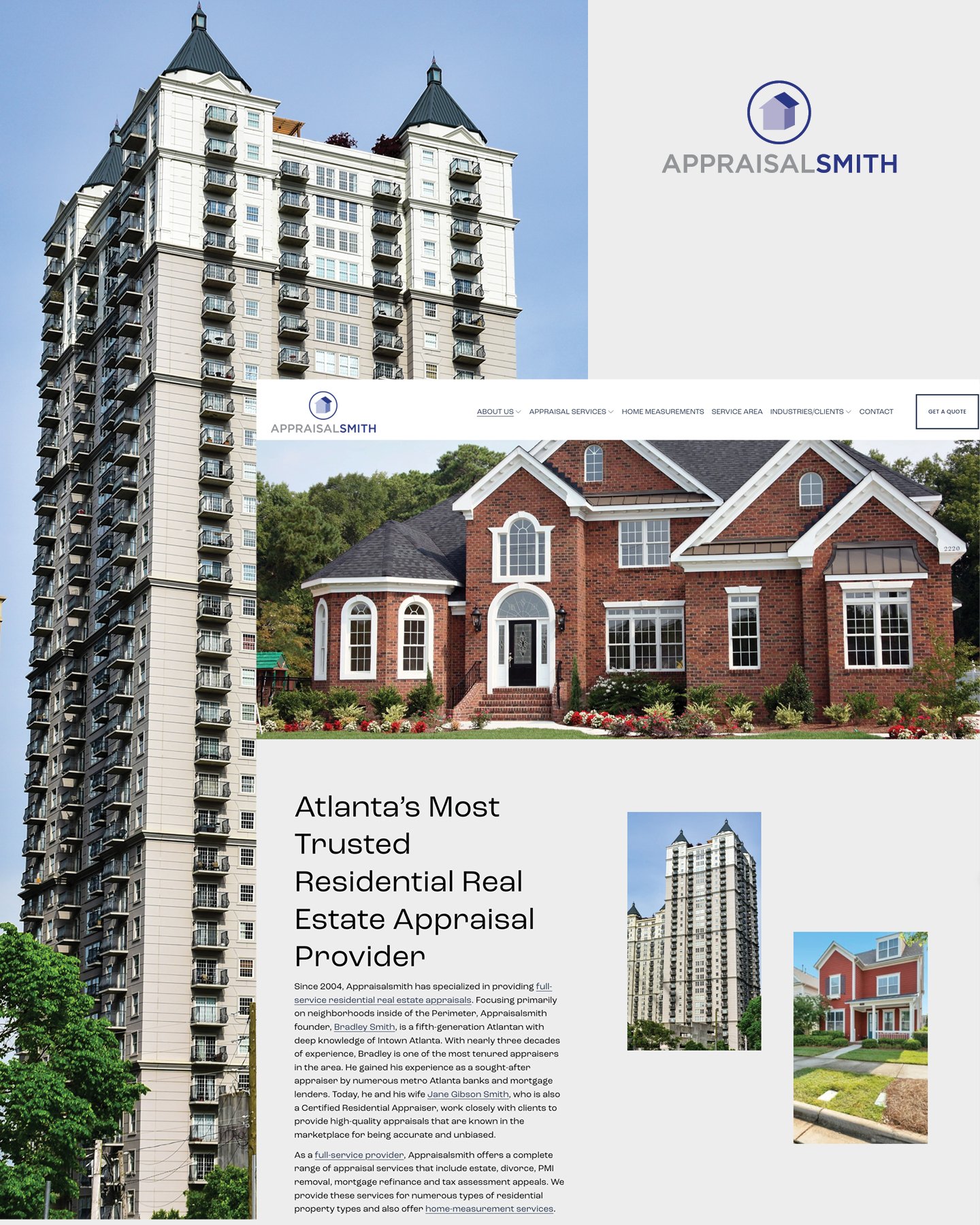
Professional doesn’t have to mean generic. Strong photography, typography and layout give Appraisalsmith a credible look with its own personality.
The goal isn’t to make a professional services website quirky for the sake of being different.
It’s to make sure professional doesn’t accidentally become forgettable.
Make the Next Step Easy
Once someone understands what you do, there’s another question your design needs to answer: Now what?
A website can have excellent copy, beautiful photography, and thoughtful layouts and still lose someone if the next step isn't clear.
That doesn't mean covering every page in oversized buttons shouting CONTACT US.
Calls-to-action work best when they make sense within the experience:
Where they appear matters.
What they say matters.
Their visual contrast matters.
What information appears immediately before them matters.
Someone reading about a specific service might be ready to request a quote. Someone else may still need to explore another page, learn about your process, or establish a little more trust first.
Your website should allow for both.
On Appraisalsmith, that meant thinking about how someone moves from understanding an appraisal service to taking the appropriate next step, and making sure the design supports that movement.
People shouldn't have to hunt for what comes next.
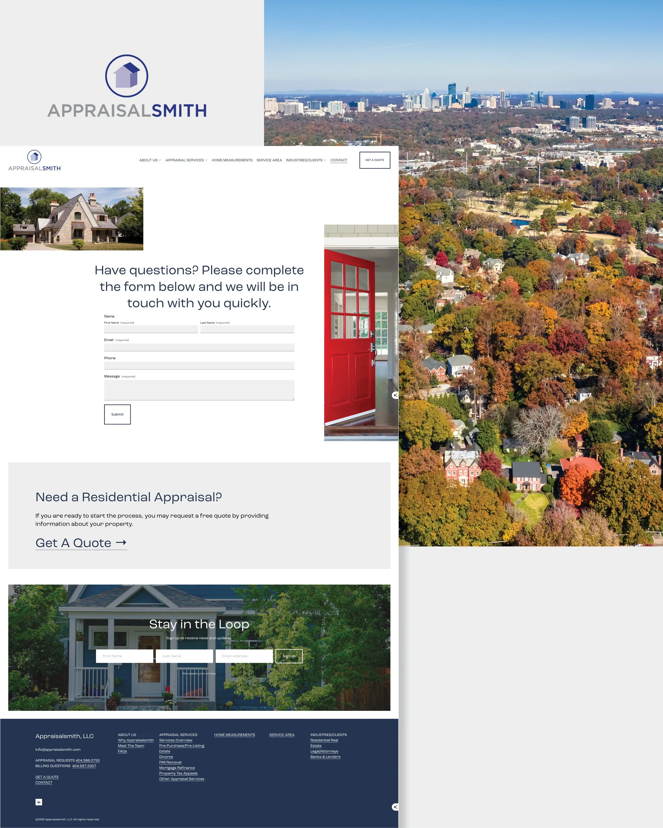
Clear calls-to-action make it easy for visitors to move from learning about a service to taking the next step.
Don’t Forget the Small Screen
Everything we’ve talked about becomes even more important when the website moves from a desktop monitor to the phone in someone’s hand.
A content-heavy website that feels spacious and easy to navigate on desktop can quickly become overwhelming if the mobile version is treated like a shrunken copy of the same thing.
On mobile, the order of information becomes part of the design.
It needs its own consideration:
How will sections stack?
How long do those headlines feel on a smaller screen?
Is there enough breathing room between pieces of information?
Are buttons easy to find and tap? Does the photography still support the content?
Can someone comfortably read the copy?
Perhaps most importantly: what does someone see first?
The order of information can feel very different once everything is stacked vertically.
Professional services website design has to account for the person doing careful research from a desktop and the person pulling up your site on their phone between meetings. Neither should get the lesser experience.
Consistency Makes a Bigger Website Feel Simpler
As a professional services website grows, there’s another challenge: keeping everything connected.
You might have individual service pages, an about section, team bios, FAQs, resources, service areas, contact information, and more. If every page has a completely different structure, your visitor has to figure out how the website works all over again every time they click.
Consistency removes some of that mental work.
Maybe:
Your service pages share a familiar flow.
Calls-to-action appear in places visitors begin to expect.
Heading styles repeat.
Photography is treated consistently.
Navigation behaves the same way wherever you are.
Those patterns teach someone how to use your website.
That doesn't mean copying and pasting the same layout onto every page. A good design system leaves room for different types of content while still making everything feel like it belongs to the same place.
It also gives the website somewhere to grow.
As services change, resources are added, or new pages become necessary, there’s already a visual language in place to support them.
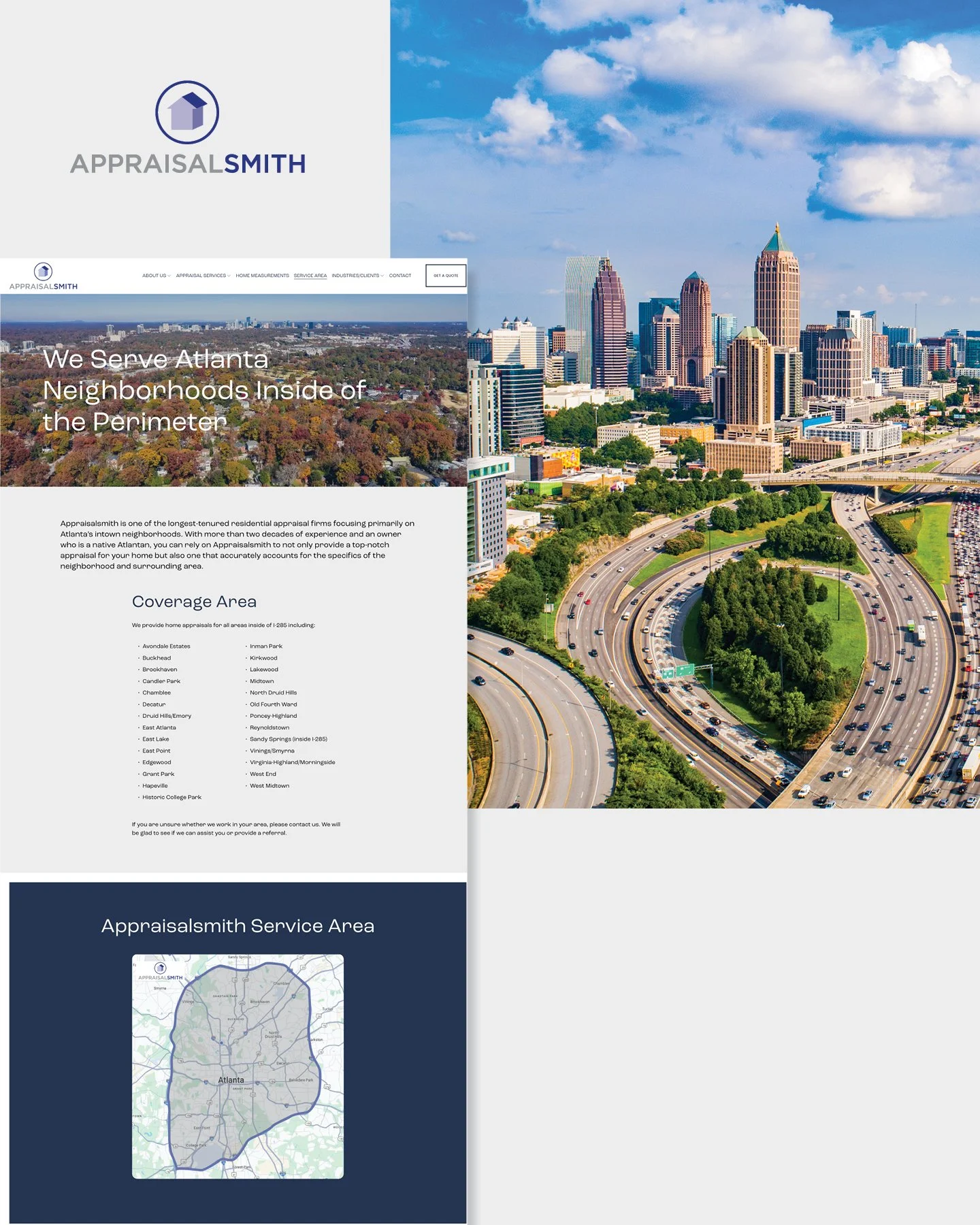
A consistent visual system helps a larger website feel connected, even when different pages serve different purposes.
Great Websites Are Collaborative
Appraisalsmith is also a good reminder that a strong website rarely comes from one person doing everything in a vacuum.
For this project, Katie Taylor of KB Taylor Marketing led the strategy and copywriting, establishing what the website needed to communicate and giving us a strong content foundation to work from.
JonesHaus handled the website design and development, taking that strategy and asking another set of questions:
How should someone experience this information?
What needs more emphasis?
Where does the eye need a break?
How should these pages relate to one another?
What does someone need to see before they're ready to take the next step?
That's one of the things we enjoy about collaborative website projects. When strategy, copy, design, and development are all treated as distinct, but connected, parts of the process, each one can do its job better.
The copy shouldn't have to compensate for confusing design, the design shouldn't have to compensate for unclear strategy, and development shouldn't be asked to piece together decisions that were never fully considered.
Strategy, copy, design and development work best when each one has a clear role.
It all works together.
It also means we’re very comfortable joining an existing creative team. Sometimes we work directly with the business owner from the beginning. Other times, we partner with marketing consultants, copywriters, and other creatives who have already done important work before the project reaches us.
Either way, the goal is the same: make the final experience feel seamless to the person using it.
Make It Easy to Understand What You Do Well
Your business may genuinely be complicated:
You may have years of expertise that can't be summed up in three sentences.
You may serve several audiences.
You may offer services that need explanation before someone understands why they need them.
However, you don't have to strip all of that away in pursuit of a cleaner website.
You need to make it easier to navigate.
Thoughtful professional services website design helps someone understand what you do, find the information that's relevant to them, recognize the expertise behind your business, and confidently decide what to do next.
A clear website doesn’t make your business less sophisticated. It makes your expertise easier to understand.
That’s the difference between a website that simply contains a lot of information and one that knows how to communicate it.
Your business may have a lot to say, and your website should make it easy to understand.
JonesHaus designs thoughtful, strategic websites that bring clarity and personality to professional brands, without losing the expertise that makes them worth choosing.
If your website has plenty to say but isn't making it easy for the right people to find what matters, let's talk.