
Sometimes the most impactful work isn’t starting from scratch; it’s refining what’s already there.
Not every website needs a full rebrand or a complete rebuild. In many cases, the foundation is solid. The work is strong, the business has evolved, but the website hasn’t quite kept up.
That was exactly the case with a recent project I worked on, refreshing my brother Rob’s photography website, built on Squarespace.
Rob had already taken a few steps forward over the years. He upgraded from Squarespace 7.0 to 7.1, added a SHOP feature, and continued building out his portfolio with new work. But even with those updates, his website wasn’t doing enough to support him from a marketing standpoint.
The issue wasn’t the work; it was everything around it.
That’s something we see often with creatives: beautiful portfolios paired with websites that aren’t doing enough to help them get found or convert inquiries.
So this project became less about designing something new and more about making what was already there work better.
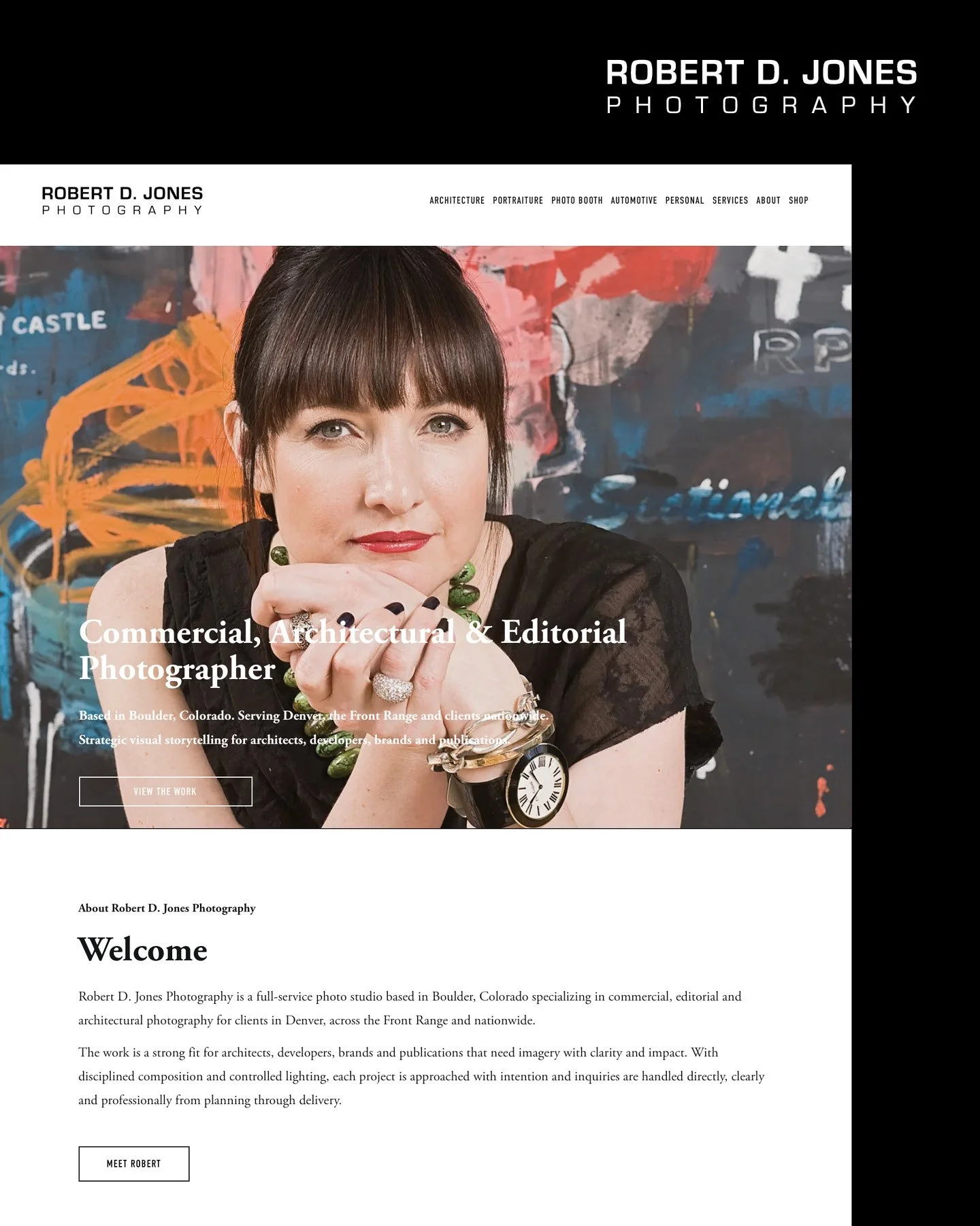
The refreshed homepage brings Rob’s work front and center with stronger positioning, clearer navigation, and a more polished first impression.
A Common Creative Website Problem
The original site wasn’t bad. It just hadn’t evolved enough to match how people search and make decisions today.
That’s a subtle but important distinction.
At a glance, everything looked fine, but once we stepped back and looked at it through a strategic lens, a few things became clear:
The copy was minimal, especially on key pages like services
There wasn’t a clear keyword strategy in place
Calls to action felt generic and easy to overlook
Meta descriptions were missing entirely
URLs weren’t optimized for search
Location was mentioned, but not in a way that actually supported SEO
Individually, these might seem small, but together, they create friction.
That friction can easily cost you visibility.
It’s a good reminder that a strong portfolio alone isn’t enough anymore. Your website needs to support how people find you, understand your work, and decide to reach out.
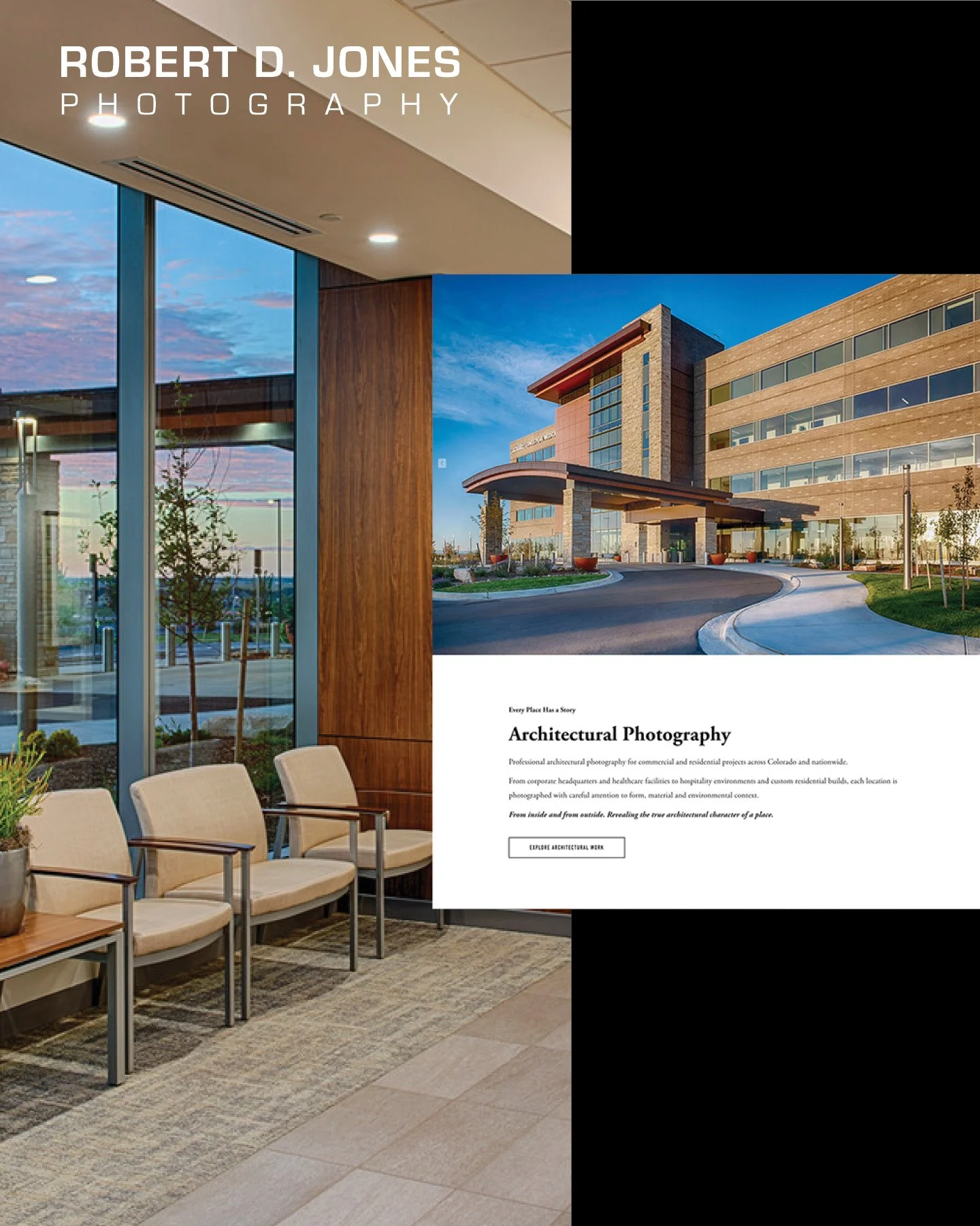
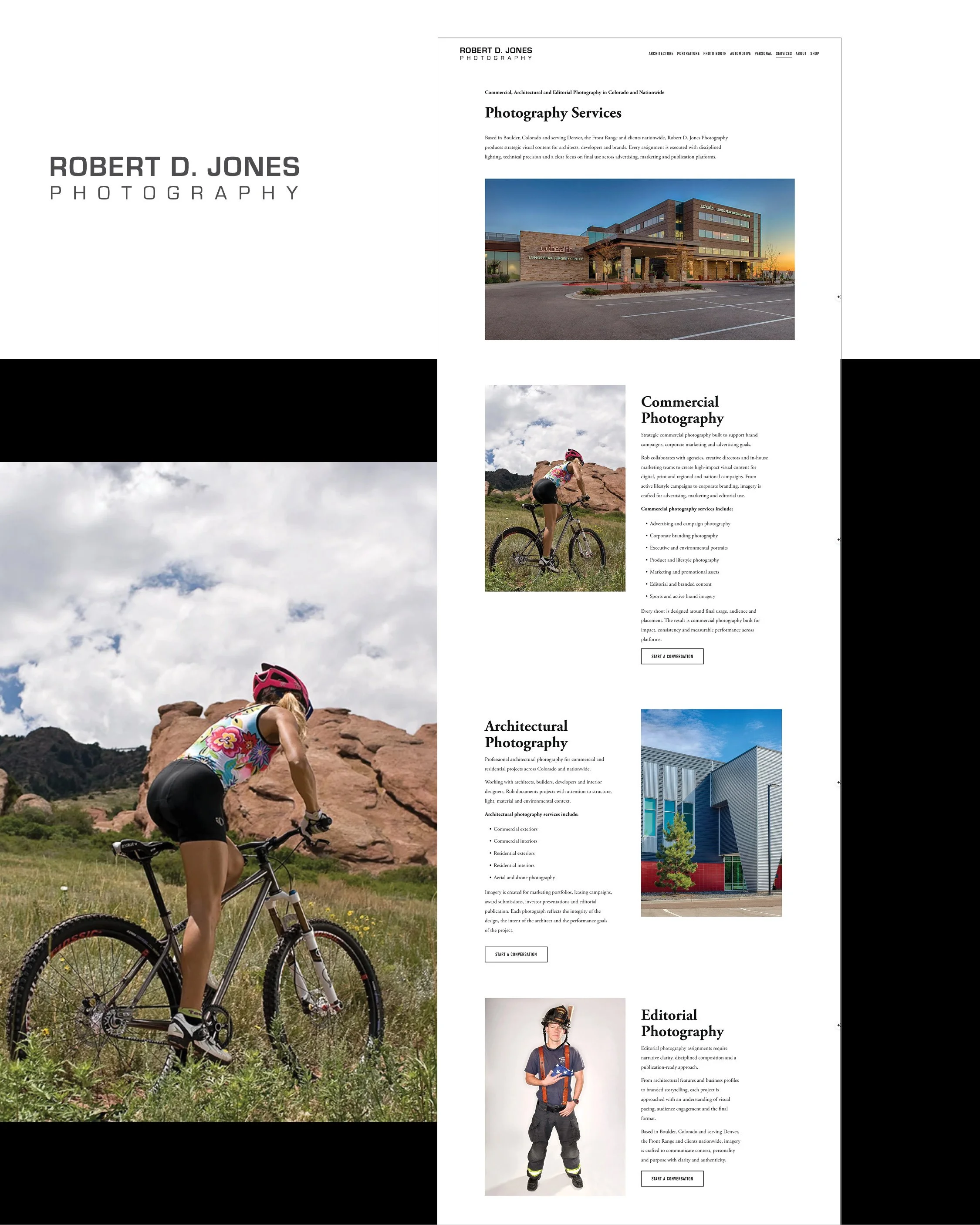
One key improvement was the addition of targeted service pages, like architectural photography, designed to support SEO, clarify offerings, and attract the right inquiries.
SEO and AIO Working Together Strategically
For this refresh, we took a practical, modern approach.
We used AI to help streamline the initial copywriting process, not as a shortcut, but as a starting point. From there, the real work was in refining and shaping the content so it felt aligned, intentional, and useful.
That meant:
Adjusting the tone so it felt like Rob
Structuring pages with a clear purpose
Aligning the language with how people search
We also started layering in AIO (AI Optimization), which is becoming increasingly important as search behavior evolves. It’s not just about ranking on Google anymore. It’s about how your content performs in AI-driven search environments, too.
The takeaway here is simple: AI can help you move faster, but strategy is what makes it effective.
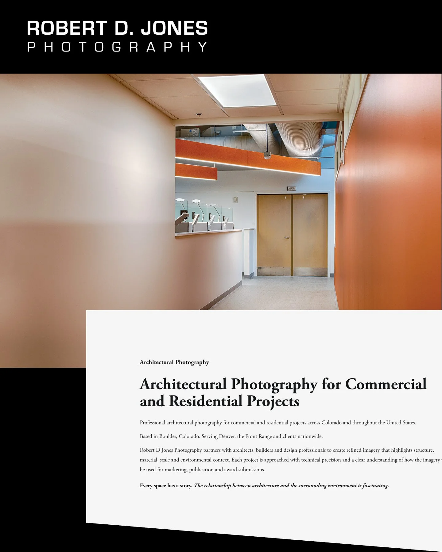
The architectural landing page was built to do more than describe a service. It helps align search visibility, clarify expertise, and create a stronger path to inquiry.
Giving the Work Context Through Stronger Copy
One of the biggest shifts we made was also one of the most straightforward: we added more substance.
The services pages, especially, needed clarity.
Not just what he offers, but:
Who it’s for
Why it matters
What someone can expect
We expanded the copy, introduced natural keyword language, and gave each page a clear role within the site.
We also brought location into the content more intentionally, not just in the footer or tucked into a single line, but integrated throughout the site in a way that supports how people actually search.
Because people aren’t just searching for a photographer, they’re searching for one near them, in their city, for their specific need.
Without that context, even great work can go unseen.
By expanding the services page with clearer descriptions and stronger structure, the site now gives the work more context and creates a better path to inquiry.
Fixing the Calls-to-Action, Because This Is Where Websites Lose People
This is something we see all the time.
A website looks beautiful, the work is impressive, but there’s no clear next step.
Before, the calls-to-action were there, but they weren’t doing much. They felt passive and easy to scroll past.
So we made them more intentional by making them:
More specific
More visible
More closely tied to the services being offered
It’s a small shift on the surface, but it changes how someone moves through the site.
Because getting someone to your website is only half the job, guiding them to take action is the other half.
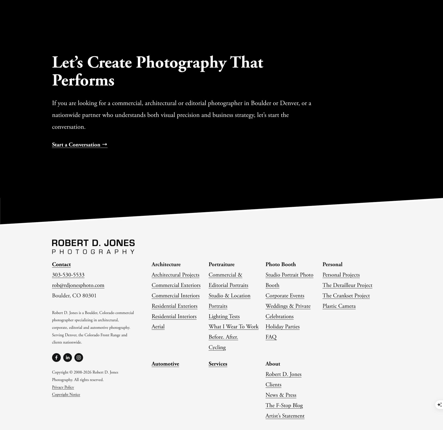
A stronger call to action on the services page helps turn interest into inquiry, giving visitors a clearer and more intentional next step.
The Behind-the-Scenes Work That Gets You Found
A lot of what we updated isn’t immediately visible, but it’s what makes the site perform.
We added:
Meta descriptions for each page
Optimized page titles
Cleaner, keyword-friendly URLs
We also made sure the content itself was structured in a way that search engines can understand.
This is the part most people skip, and it’s usually why a site isn’t getting traction, even when the work itself is strong.
Why This Matters, Especially for Creatives
If you’re a photographer, designer, or creative business owner, this probably feels familiar.
You’ve invested time and energy into your work, and you’ve built something meaningful, but your website hasn’t quite kept pace.
However, your website isn’t just a portfolio.
It’s a key part of how people find you, evaluate you, and decide to reach out.
SEO helps you get discovered, and AIO helps you stay relevant in how people search today.
Strategy is what ties it all together by turning your website into something that supports your business.
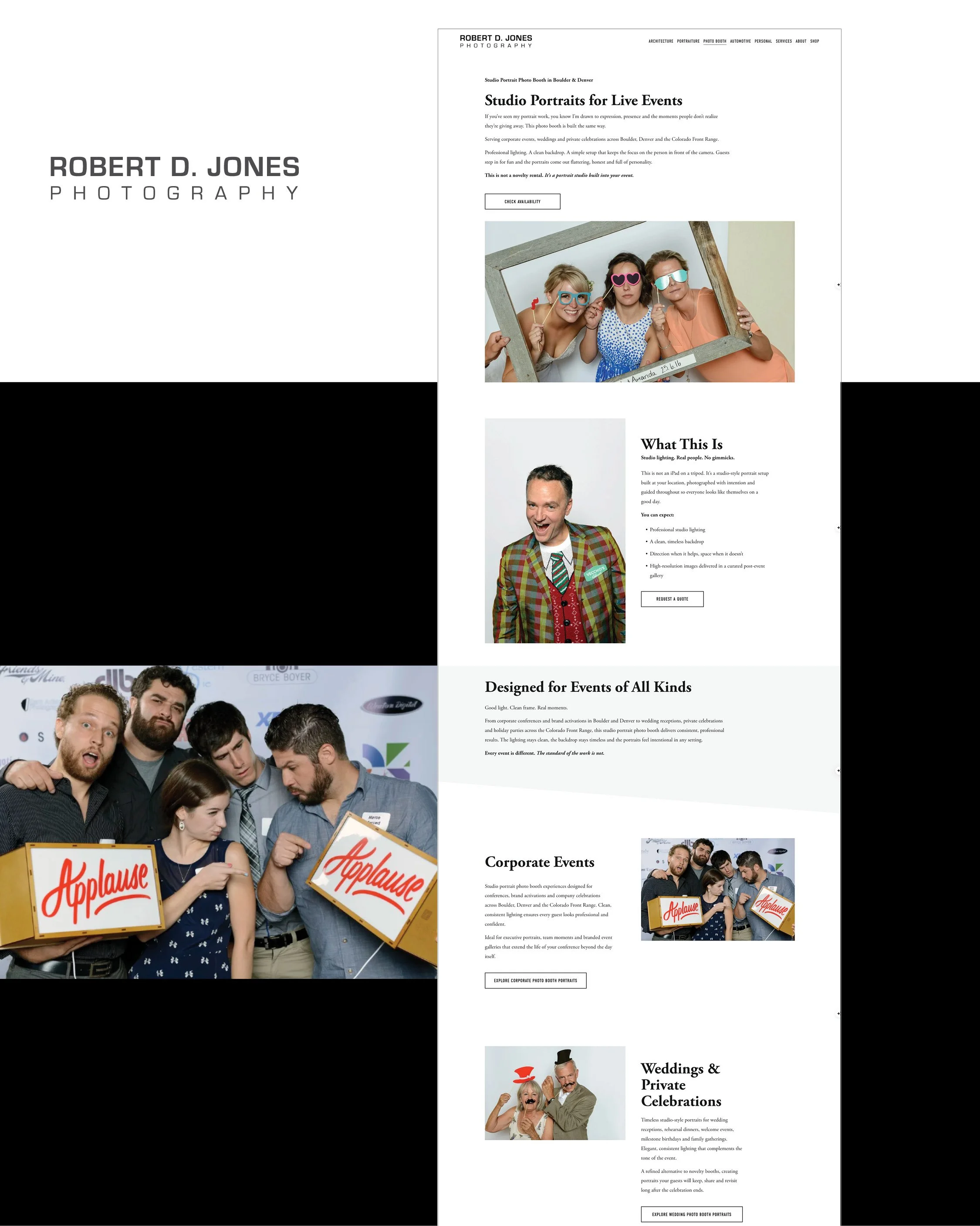
The Studio Portrait Photo Booth landing page reflects the bigger shift behind the refresh: giving each service more context, clearer positioning, and a stronger chance of being found.
You Don’t Always Need to Start Over
One of the most important takeaways from this project is that we didn’t start from scratch.
We didn’t rebuild the entire site.
We worked with what was already there and made it stronger.
Often, that’s the smarter move.
Especially when:
The foundation is solid
The work is already strong
The goal is to improve performance, not reinvent everything
A strategic Squarespace website refresh can go a long way.
Your Website Should Be Helping You Book More Clients
A strong portfolio deserves more than just a place to live online.
It should:
Help you get found
Help you communicate clearly
Help you convert interest into real inquiries
If your website feels a little outdated or like it’s not pulling its weight for your business, it may not need a full overhaul.
It may just need a more strategic approach.
That’s exactly what we do at JonesHaus, helping creatives turn their websites into tools that support their business. Reach out today to chat about your website!
We also share more of our approach on LinkedIn, from behind-the-scenes project work to practical ways to strengthen your brand and online presence.