
Even though many often think that graphic and interior design professions go hand in hand, they are far more different than they are alike. Both types of design do of course have similarities as both work with stakeholders to complete projects.
However, graphic and interior designers are beginning to find it valuable to collaborate with other creative disciplines. When both designers come together there are more innovative opportunities presented. As a result, this enables them to present unique and creative projects to their clients.
So, you may be thinking, what are the key differences between graphic design and interior design?
Graphic design is mainly in the second dimension with a lot more freedom in what you want to portray. The seven basic elements of graphic design are line, shape, color, texture, type, space, and image.
It also encompasses storytelling and creating experiences that resonate with a brand’s target audience. The world we live in is practically surrounded by graphic design as brands communicate information and identity all around us.
On the other hand, interior design works mainly in three dimensions, and you must think logically, creatively, and practically. The respective interior design elements include space, line, forms, light, color, texture, and pattern; and keeping them balanced is the key to creating an aesthetically pleasing interior. According to one of America’s top interior designers, Christina Murphy, “Punches of color keep a room feeling youthful and engaging.”
The Secret Power in the Color Purple
While purple is not as popular of a color used in today’s home design, it’s been historically known for centuries to be associated with royalty. According to the book, “The Secret Language of Color” by Joann Eckstut and Arielle Eckstut, purple is said to speak of high places as it’s not the easiest color to create. Centuries ago, only those of royal status could often afford purple as the production of dye was extremely limited. It was the most laborious, time-consuming, and expensive processes around. Those who wore fashion with purple dye in it did so with pomp and circumstance. Purple can create a harmonious balance of awareness and peace in any room. It fosters creativity by awakening our senses while promoting the quiet necessary to make intuitive, insightful observations. Regina Brett, journalist and author, from 1956 would say, “Be eccentric now. Don't wait for old age to wear purple.” It’s a color that deserves some love in graphic and interior design. Whether you add a simple purple blanket or décor as an accent you can make a room come alive with the littlest touch of violet.

One of the Most Underrated Colors: Gray
Who needs white and beige anymore for neutral design? Gray is known to be the color of balance and neutrality. It’s the perfect neutral as it can moderate brighter hues and pull a color scheme together. While it’s known to portray intellect and compromise, it’s a diplomatic color, as it’s right between black and white hues. Many people consider gray to be conservative, elegant, and cool, though it can be a bit mysterious. According to Andre Gide, French author, and winner of the Nobel Prize in Literature, of 1869-1951, “The color of truth is gray.”
Don’t forget, it’s timeless and practical. Dark, charcoal gray communicates some of the strength and mystery of black as it pulls closer towards black. On the other hand, light grays can carry some of the attributes of the color white.
Want to understand other meanings associated with the color gray? Read them below.
The phrase “gray matter” refers to smarts, intelligence, brains, and intellect.
The term “gray page” is a text-heavy page with very little contrast or white space.
The 3 Main Paint Colors in My Home
Back when I was renovating my home, I actually hired an architect to draw up the plans and was the General Contractor on the job hiring and working with all the subcontractors. It was a 4-month project that was permitted by the City of Atlanta, and it came with a few surprises. The foundation piers were crumbling and at one time unable to support the weight of the new construction. Plus, the house was jacked up and new foundation piers were poured before we could begin the build. There are always unknowns in construction, unforeseen delays, and cost overages of 20%.
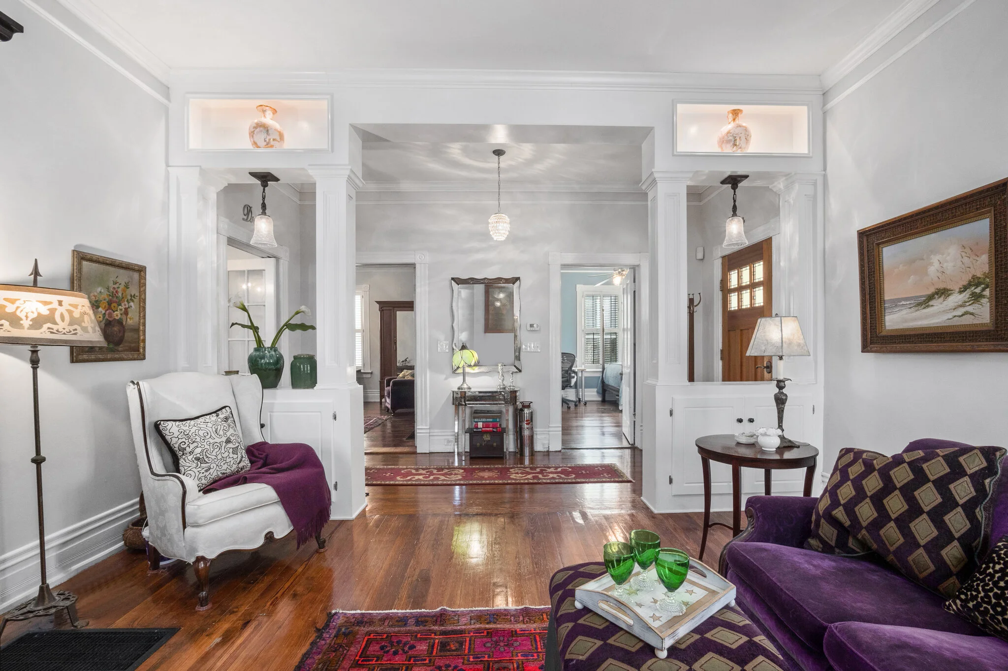
Are you wondering what colors are implemented in my home? Check out this beautiful photo of my living room below. With an unlimited choice of colors I finally came to select three.

Eider White: It pairs perfectly with black and white for balanced contrast. It also has a cool undertone, and comes out looking still a bit warm yet doesn’t give off a “concrete” feeling.
If you’re on the hunt for a color for your entire home, Eider White is my go-to. It plays well with other whites, so you don’t feel like you are walking into a sterile space.
Reprose Gray: Repose Gray is darker and just a bit plainer gray than Eider White. It brightens any white room and provides contrast in a space. Plus, it favors a soft purple undertone. Don’t be afraid to add a little bit of violet to any room when it pairs well with gray.
Watery: As the name suggests, this paint color exhibits the appearance of water – one of serenity, a silent and cool blue with deep tinges of green. Not only does it look cool, but it’s also crisp when applied to the walls.
So, if you are looking for a color experience that is enchanting and tranquilizing – you should try Watery. It can make any room have a coastal vibe. Get ready to feel like you’re right by the water any day.
Designing the colors of my home was such a fun experience and it was important to me to ensure every room felt balanced.
Interested in leveling up your business through evaluating your social media accounts and branding?
At JonesHaus, we offer marketing strategy and services that are deeply rooted in the kind of resonance that’s achieved through great graphic design. We recently created a Social Media Roadmap to help small businesses audit their own social media accounts so they can implement stronger marketing strategies that consist of cohesive brand strategies and social media posts! Snag a copy today for everything you need to know on how to audit your platforms, sharpen your branding and establish a consistent social media presence.